Table of Contents
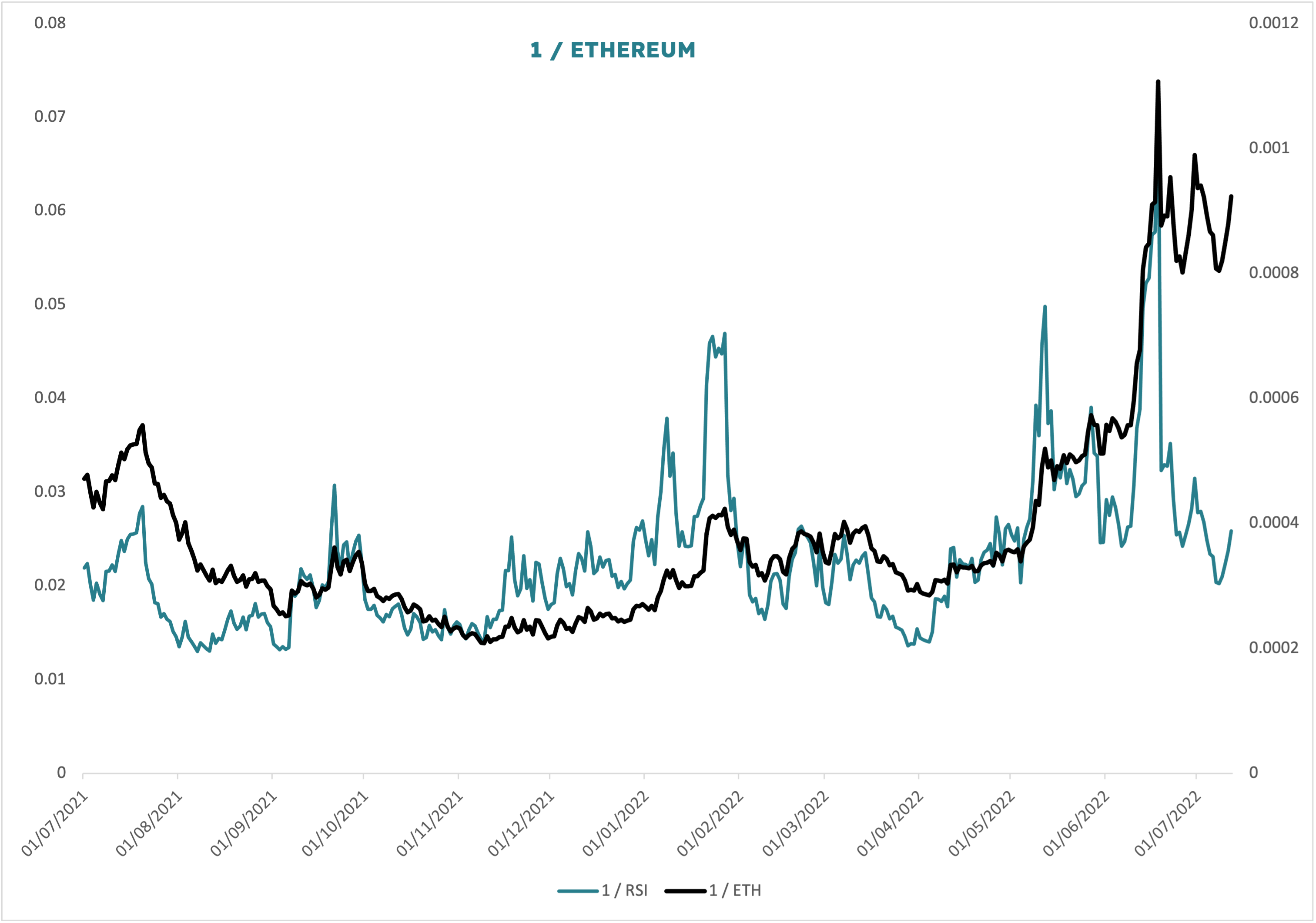
Sometimes it helps to invert a chart to see if it offers more insight that way. Here I have simply reformatted as follows: 1 / Ethereum and 1 / RSI. So whereas set normally we would be looking at a falling line for ETH, here we see a rising one.
My first instinct looking at the chart this way is that we are looking at a blowoff top with a massive momentum divergence. Notice ETH has gone vertically up and RSI has followed it. But then the price chop begins and RSI simply doesn’t track as precisely. This is a momentum divergence which, were we actually looking at a top, would be taken as a big warning sign that the highs were unsustainable on deteriorating power.
Since the data is inverted however, the insight is that a large degree bottom in prices may be forming.